Static ads are far from dead—in fact, they’re some of the most efficient and high-performing formats in paid social today. From bold visuals to snappy copy and mobile-first layouts, great static creative is built for speed and clarity. This post breaks down 12 standout examples across Meta and LinkedIn, explains why they work and shows how Superads helps marketers analyze performance by creative element.
Think static ads are dead? Think again.
Every year, we hear the same prediction: static image ads are on their way out. But the data—and the results—tell a different story. Behind the scenes of high-performing campaigns, smart marketers and creative teams are still driving massive impact with static ads that stop thumbs, spark curiosity and deliver results.
Static doesn’t mean boring. It means fast-loading, cost-efficient and creatively agile—especially when executed with precision. Whether it’s a punchy headline, a bold visual, or a no-friction CTA, today’s top-performing static ads are crafted with intention and backed by data.
In this guide, we’ll break down 12 standout static ad examples that are winning in 2025—across Meta, LinkedIn and TikTok—and explain exactly what makes them work. You’ll get actionable insights, strategic takeaways, and a fresh dose of inspiration for your next campaign.
And because great creative deserves great analysis, we’ll also show you how Superads makes it easy to identify what’s working, spot emerging trends, and share data-backed insights with your team. No more guesswork. Just better creative decisions, faster.
Why static ads still matter in 2025
Static ads aren’t just surviving, they’re winning.
- Static ads can generate up to a 50% increase in sales for specific marketing campaigns.
- Static display ads drive consistently low CPMs, outperforming video in retargeting and UGC-style placements.
- Static formats dominate top-of-funnel (TOF) prospecting and are favorites for quick creative testing.
On the LinkedIn side, static ads dominate in top-of-funnel prospecting. Their direct messaging and clean visuals make them a favorite for B2B brands looking to cut through the noise with high-impact creative that’s easy to iterate.
Why do they still work so well? It comes down to speed, clarity and versatility. While video pushes creative boundaries, static assets remain the fastest way to test messaging, highlight value props and deliver instant visual impact.
What makes a great static ad?
There’s a formula behind the most effective static ads.
In 2025, with crowded feeds and shrinking attention spans, your static ad has to earn its keep in a split second. The best-performing creatives have five things in common—and they’re surprisingly easy to replicate once you know what to look for.
Scroll-stopping visuals
The best static ads grab your attention fast. That might mean a bold color contrast, an unexpected layout, or just a really well-composed product shot. Whatever the approach, the goal is the same: stand out in a crowded feed and get someone to pause.
Snappy copy and headlines
You’ve got a few words to make a point. Strong static ads lead with benefit-driven headlines—simple, punchy lines that make the value obvious. Think less “clever tagline,” more “here’s what you’ll get.”
Clear call to action
A static ad should make the next step feel easy. Whether it’s “Shop now,” “Get a demo,” or “See pricing,” the best CTAs are direct and give people a reason to click. No ambiguity, no extra steps.
Mobile-first composition
Most of your impressions are happening on mobile—on small screens, in fast-scrolling feeds. So everything about your static ad needs to be built for that environment. Big type, clear focal points and a layout that reads in under a second.
Creative clarity
The top-performing ads usually have one job and do it well. That might be highlighting a sale, promoting a lead magnet, or driving brand recall. But it’s rarely all three. Static ads that try to say too much end up saying nothing at all.
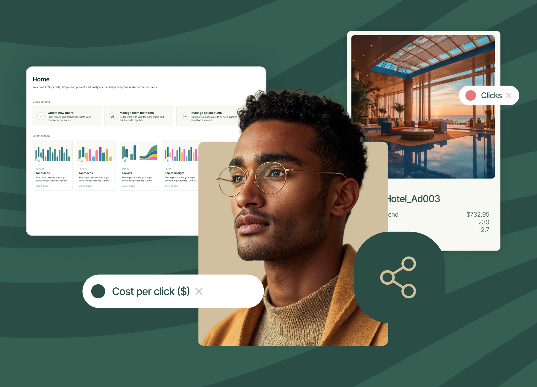
Measuring this stuff matters, whether it's Meta, LinkedIn or TikTok. With Superads, you can break down your creative analytics by things like headline, CTA and visual style—so you’re not just guessing what’s working. You’ll know exactly which ads are driving results and why.
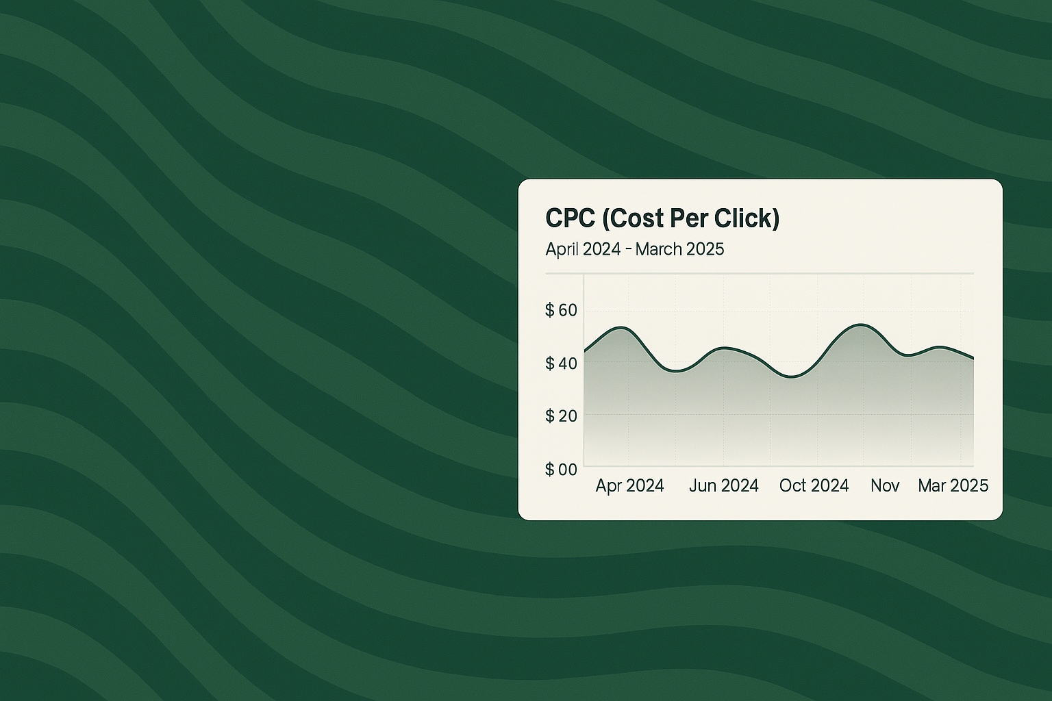
And if you want to explore the latest Facebook Ads benchmarks—which are super valuable for comparing your Meta ads spend—use our tool to filter by industry, country, or campaign type and uncover fresh insights on CPC, CPM and CTR.
The power of data: stop guessing, start winning with Superads

Relying on creative “gut feel” might get you lucky once, but it’s not a strategy you can scale. Static ads live and die by how they perform in the real world, not how they look in a Figma file. The problem? Without the right tools, it’s hard to know what’s actually working.
Creative fatigue creeps in. An ad your team loves might be tanking after a few days live, but no one notices until the budget’s spent.
Subjectivity clouds testing. Everyone has a different opinion on which ad “feels” strongest, but that rarely lines up with the data.
Blind spots develop. Your best-performing static ads can get buried, while underperformers keep getting budget because no one’s tracking performance consistently.
This is where Superads changes the game. We take the guesswork out of static ad performance by giving marketers instant visibility into what’s working—and why—across platforms like Meta and LinkedIn.
With Superads, you can:
- Compare static ads by performance—broken down by hook, CTA, image style and more
- Spot creative fatigue early, and shift spend before performance drops
- Find top-performing static ads across multiple accounts and campaigns in minutes, not weeks
No spreadsheets, no waiting for end-of-month reports, and no guessing which creative to scale. Superads gives you the insight to back every creative decision with real data.
Want to know which static ads are actually moving the needle? Superads tells you—fast.
12 static ads examples to inspire in 2025
We’ve curated 12 standout static advertising examples making serious impact in paid social. For each ad, we’ll break down why it works, what you can learn, and exactly how Superads would spot the winning pattern.
1. Picsart by Superside

Source: Superside
Platform: Instagram Stories
Industry: Marketing Tech
This bold, vertical static ad features a striking central image: a confident, carefree creator framed against a dramatic desert backdrop. The creative leans into vivid natural lighting and a sense of freedom—perfectly aligned with Picsart’s positioning as a platform for creators.
The messaging is minimal but effective, with the line “Create Bold Content” grounding the ad in clear intent. The Superside-designed asset ran across Instagram Stories to engage creative-forward users with scroll-stopping simplicity.
Why it works
- Visual dominance: The centered subject and contrasting colors grab attention instantly, even in a fast-moving Story feed.
- Minimalist copy: “Create Bold Content” is short, action-oriented and benefit-driven—ideal for top-of-funnel creative.
- Vertical composition: Optimized perfectly for Instagram Stories, making full use of the screen real estate without clutter.
- Aspirational tone: It speaks directly to creators looking for freedom and self-expression—exactly the emotional hook Picsart’s audience responds to.
2. Semrush

Source: Semrush
Platform: Meta
Industry: Martech / SEO Tools
This static ad runs as a two-frame carousel or split variation. The first version hits hard with a performance stat—“Want to grow revenue 1,800%?”—supported visually by a rising analytics graph.
The second version pivots to a case study: “The Cycleverse did & you could too,” humanized with a relatable lifestyle image. Both versions use bold brand colors, consistent typography, and a clear CTA (“Discover How”) to guide the viewer.
Why it works
- Data-driven trust signal: Leading with “1,800% revenue growth” hooks attention and lends instant credibility.
- Social proof: The Cycleverse mention acts as a micro-case study, triggering FOMO and validation in social media.
- Color consistency: SEMrush’s signature palette reinforces brand recall and builds trust through visual cohesion.
- CTA clarity: “Discover How” is action-oriented and curiosity-driven without overpromising.
3. Nike

Source: Nike
Platform: Meta and Display Network
Industry: Apparel / Sportswear
This static ad is a masterclass in minimalist impact. The bold, all-caps headline “Be A Better Athlete” is center-aligned over a clean grey background, with Nike’s logo up top and a crisp product shot anchoring the bottom.
The design is stripped of distractions—just bold typography, a single focal image and a message that speaks directly to personal performance.
Why it works
- Strong brand presence: The Nike logo and product image reinforce brand equity instantly—no guesswork needed.
- Focused messaging: One benefit. One product. One goal. The clarity of “Be A Better Athlete” leaves no room for misinterpretation.
- Design discipline: The monochromatic background makes the shoe and text pop, drawing the eye exactly where it needs to go.
- Visual hierarchy: Text placement, logo positioning and product layout guide the viewer smoothly from top to bottom.
4. HP

Source: HP
Platform: Meta
Industry: Office Tech / SMB Productivity
This static ad leans into seasonal relevance with the headline: “Make tax season less taxing.”
It pairs a clean product shot of the HP OfficeJet Pro with a bold red background and clear typography. The combination of humor and urgency makes it highly contextual—perfectly timed for small business owners feeling the crunch of tax prep.
Why it works
- Contextual timing: Directly aligns with a pain point (tax season stress), which boosts relevance and click-throughs.
- Strong CTA contrast: The red and white palette draws immediate attention and ensures the messaging doesn’t get missed.
- Clear use case: The product isn’t just shown—it’s positioned as a direct solution to a specific problem.
- B2B targeting done right: Focused on small and medium businesses, the ad speaks in their language without jargon or fluff.
5. Disney+

Source: Disney+
Platform: Meta
Industry: Entertainment / Streaming
This bold static ad brings together some of the biggest names in the Marvel franchise—Guardians of the Galaxy, Ant-Man, The Marvels, and Black Panther: Wakanda Forever—framed in a neon glow and backed by a cinematic dark blue gradient.
The headline anchors the offer: "Re-enter the Marvel Cinematic Universe, now with IMAX Enhanced sound by DTS." Logos for Disney+ and IMAX sit at the top, while the CTA at the bottom makes it clear: “Now streaming on Disney+.”
Why it works
- Instant recognition: Beloved characters and major movie titles create an immediate emotional and visual hook.
- Logo stacking: Featuring IMAX and Disney+ builds trust and clarifies the value prop without needing lengthy copy.
- Thematic visuals: The ad feels like a trailer in a single frame—dynamic, immersive, and high-stakes.
- Message clarity: The value—IMAX Enhanced sound and viewing experience—is front and center, with a no-friction CTA.
6. Pepsi

Source: Pepsi
Platform: Instagram
Industry: Food & Beverage
This eye-catching static ad uses a split-screen concept to showcase two distinct Pepsi identities: classic and zero sugar. On the left, a pastel beach scene features the signature blue can in a soft, glam setting.
On the right, the black can appears in a dry, desert backdrop, held confidently with a stark, rugged tone. The headline “Fantastic or Bombastic? We’re both” bridges the two worlds—playful and bold—emphasizing dual appeal in both style and flavor.
Why it works
- Split-screen contrast: Juxtaposing two aesthetics side-by-side instantly captures attention and communicates product variety.
- Clear product positioning: Blue = original. Black = zero sugar. No extra copy needed.
- Vibrant visual storytelling: Each side tells a different story, but the brand stays front and center—both visually and tonally.
- Memorable headline: The playful rhyme makes the message sticky while reinforcing Pepsi’s confident, personality-driven brand voice.
This is a great example of how static ads can create movement and narrative, without needing animation or video.
7. Indeed

Source: Indeed
Platform: Meta and Display Network
Industry: Recruitment / HR Tech
This static banner ad from Indeed uses bold simplicity to speak directly to job seekers. The design keeps it clean with plenty of white space, a short, direct message and the instantly recognizable Indeed logo in the corner.
The core message—usually something like “Find jobs that work for you”—delivers value in one line, positioning Indeed as the most accessible, user-centric hiring platform.
Why it works
- Extreme clarity: The ad gets to the point instantly—no need to decode or scroll.
- Whitespace as a strength: The minimal design draws focus to the headline and CTA, creating a sense of ease and trust.
- Brand familiarity: Indeed’s visual identity (blue text, simple logo) is immediately recognizable, especially for active job seekers.
- Intent alignment: Whether viewed passively or with job-hunting intent, the message lands. It’s timely, relevant, and low-friction.
8. TrueHeight

Source: TrueHeight
Platform: Meta (Facebook, Instagram Feed)
Industry: Health & Wellness / Supplements
This static ad from TruHeight features three product shots—supplements and a protein shake—against a softly lit, natural background.
The headline, “Your growth starts with the first purchase,” serves a dual purpose: highlighting both physical development and the act of buying. A bold 15% discount code (THFIRST) anchors the incentive, reinforcing urgency without pressure.
Why it works
- Clever copywriting: The pun ties perfectly into the brand promise—growth—while making the offer feel personal and proactive.
- Visual warmth: Natural tones and soft lighting give the ad a wellness-focused aesthetic that feels trustworthy and clean.
- Clear promo: The discount offer is simple, visible, and backed by a bold CTA (the code), lowering friction for first-time buyers.
- Product-forward layout: Each item is clearly visible, which boosts product recognition and perceived value.
9. Jambys

Source: Jambys
Platform: Instagram Feed and Stories
Industry: Apparel / Loungewear
This static ad from Jambys leads with a headline that flips expectations: “The basketball short built for watching basketball.”
The visual centers on a clean product image of the shorts, surrounded by playful callouts like “Deep stretchy pockets” and “Super-soft liner.” It blends cozy benefits with a clever twist, making comfort the hero and calling out exactly why these aren’t your average gym shorts.
Why it works
- Copy with a wink: The humor in the headline instantly humanizes the brand and grabs attention with relatability.
- Feature callouts done right: The illustrated breakdown highlights benefits without overwhelming the viewer—a smart use of space and design.
- Visual identity: The cloud-like accents, soft color palette, and clean typography all reinforce the comfort-driven vibe.
- Brand clarity: “Performance inactivewear” is a brilliant positioning line—sharp, self-aware and on-brand.
10. Elementor

Source: Elementor
Platform: Instagram Feed
Industry: Web Design / SaaS
This static ad from Elementor announces their “Website Transformations Showcase” using a bold navy-and-turquoise palette that pops in the feed.
The clean layout mirrors the product's core value—clarity and structure—while the callout “Check Out These Superstars” adds a sense of curiosity and prestige. With minimal text and strong visual hierarchy, the ad is designed to nudge viewers straight to the landing page.
Why it works
- Color contrast with purpose: The bright turquoise on dark blue grabs attention fast while staying on-brand and easy to read.
- Built-in intrigue: The phrase “showcase” plus a vague nod to “winners” encourages clicks to find out more—an effective soft-push CTA.
- Clean and structured layout: The ad design mirrors Elementor’s product promise: control, polish, and visual order.
- Feed-native design: No heavy imagery or distractions—just confident, high-contrast messaging optimized for scroll speed.
11. Wix

Source: Wix
Platform: Instagram Feed
Industry: Web Design / SaaS
This ad from Wix Partners highlights “Psychological principles of high-converting sites” with a clean, infographic-inspired layout. Set against a bold navy background, it features a stylized mockup of a landing page, annotated with visual cues like arrows and CTA buttons. The composition is minimal, informative, and designed to intrigue marketers and designers looking for tactical insights.
Why it works
- Color contrast done right: The use of navy and orange is visually striking but professional, helping the CTA and key elements stand out.
- Abstract layout with intent: The stylized annotations suggest value and insight without overwhelming the viewer—perfect for a scrollable feed.
- Direct messaging: The headline clearly tells the user what they'll get, while the caption drives action (“Download your free article”).
- Feed-friendly structure: No clutter, no hard sell—just high-value, insight-forward messaging tailored for decision-makers.
12. Crunchbase

Source: Crunchbase
Platform: LinkedIn
Industry: B2B SaaS / Sales Intelligence
This LinkedIn ad from Crunchbase promotes an ebook with the headline: “How to Develop an Effective Sales Territory Strategy at an Early Stage Startup.”
It uses clear, benefit-led copy and a clean layout featuring a stylized world map and color-coded location markers. The design directs attention to the content offered while the “Download” CTA removes friction and sets clear expectations.
Why it works
- Educational hook: The ad leans into a clear knowledge gap—startup sales strategy—making it irresistible for early-stage founders and sales leaders.
- Visual support: The dotted map and dollar-pin icons visually reinforce the topic without overwhelming the layout.
- Sharp B2B alignment: The tone, layout, and offer are perfectly suited for LinkedIn’s professional audience.
- Conversion-ready CTA: “Download” is direct, no-fluff, and lowers commitment resistance for lead generation.
Static isn’t static—it’s built to evolve
The best-performing static ads don’t happen by accident, and they don’t stay winners forever. As trends shift and platforms evolve, creative fatigue is inevitable. That’s why top creative teams don’t treat any asset as sacred.
They test, analyze and iterate—fast.
Superads takes the heavy lifting out of static ad reporting. No more sifting through spreadsheets or waiting on monthly wrap-ups. With real-time insights, AI-powered breakdowns, and cross-platform visibility, you can double down on what’s working and cut what’s not—before performance drops.
Superads helps you surface creative patterns across thousands of top-performing static ads, so you can borrow brilliance and build on what wins.
Already running campaigns? Just plug in your ad accounts and instantly see which creatives are driving results—and why.
Because in paid social, every scroll, swipe and stop is a chance to scale.
Stop guessing. Start optimizing. Static ads move fast. Superads moves faster.
Facebook Benchmarks
Check out fresh CPC, CPM, CTR
Facebook Ads data.
Filter by industry, country or
campaign type.

Improve your ad campaigns
With the only AI-powered creative insights tool
built for modern marketers.
Improve your ad campaigns
With the only AI-powered creative insights tool
built for modern marketers.